The Nucleus logo. Reinventing the brand included a refresh of the logo. I first simplified the mark by eliminating thin lines. Next I accentuated the cutouts and introduced a change in color from purple to green for a fresher, more appropriate color for the brand. Finally, I removed superfluous text and made a font style change from bold to regular.
nucleushealth.com website. Redesigned from the ground up to be responsive, clean and content driven.
The sales media kit showcases the advantages of each license offering in a clean and concise format. Testimonials and awards are a key selling point and are given prominence in the design.
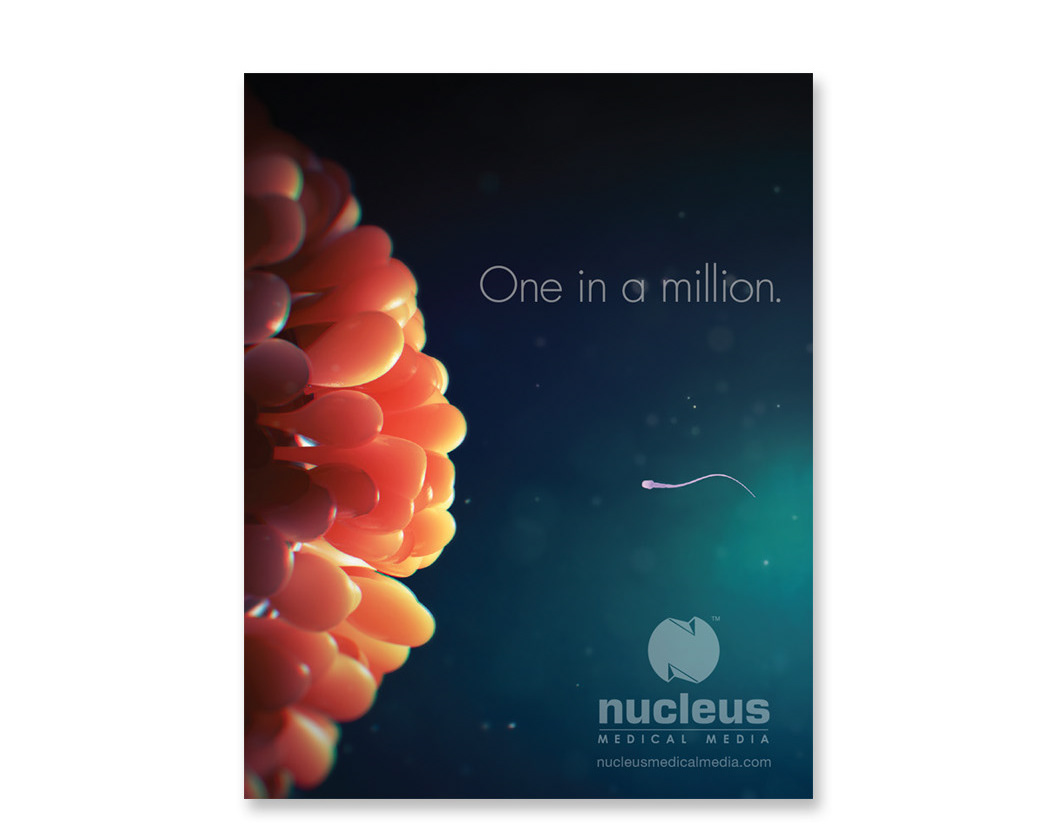
This sales brochure reinforces partnership opportunities as a take-away from conferences and meetings.
Next Project →


